Radius Architectural Inspiration
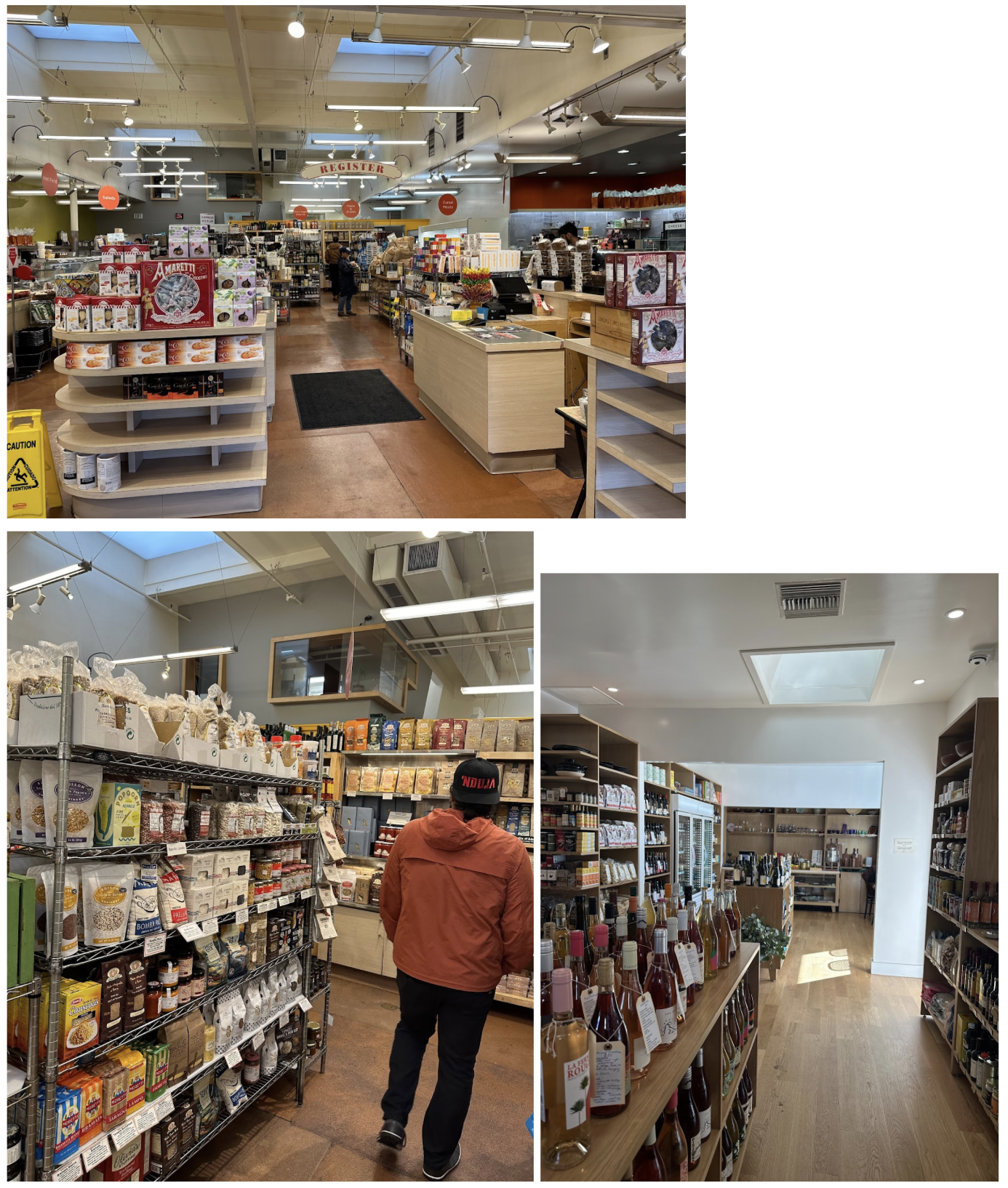
Joe and I went on a trip to LA, SF, and NYC to gather design inspiration for Radius Butcher & Grocery. We visited 11 butcher shops, 9 grocery stores, 10 coffee shops, and 6 restaurants. We hope that Radius is a combination of what we loved - the utilitarian warmth of SF coffee shops, the fresh abundance of LA grocery stores, and the proudly displayed craft butchery in NYC. Our experiences of these stores will inspire Radius design decisions, but not dictate them. We shared this document with our architecture team at Michael Hsu to inspire conversation and collaboration on Radius’s store design.
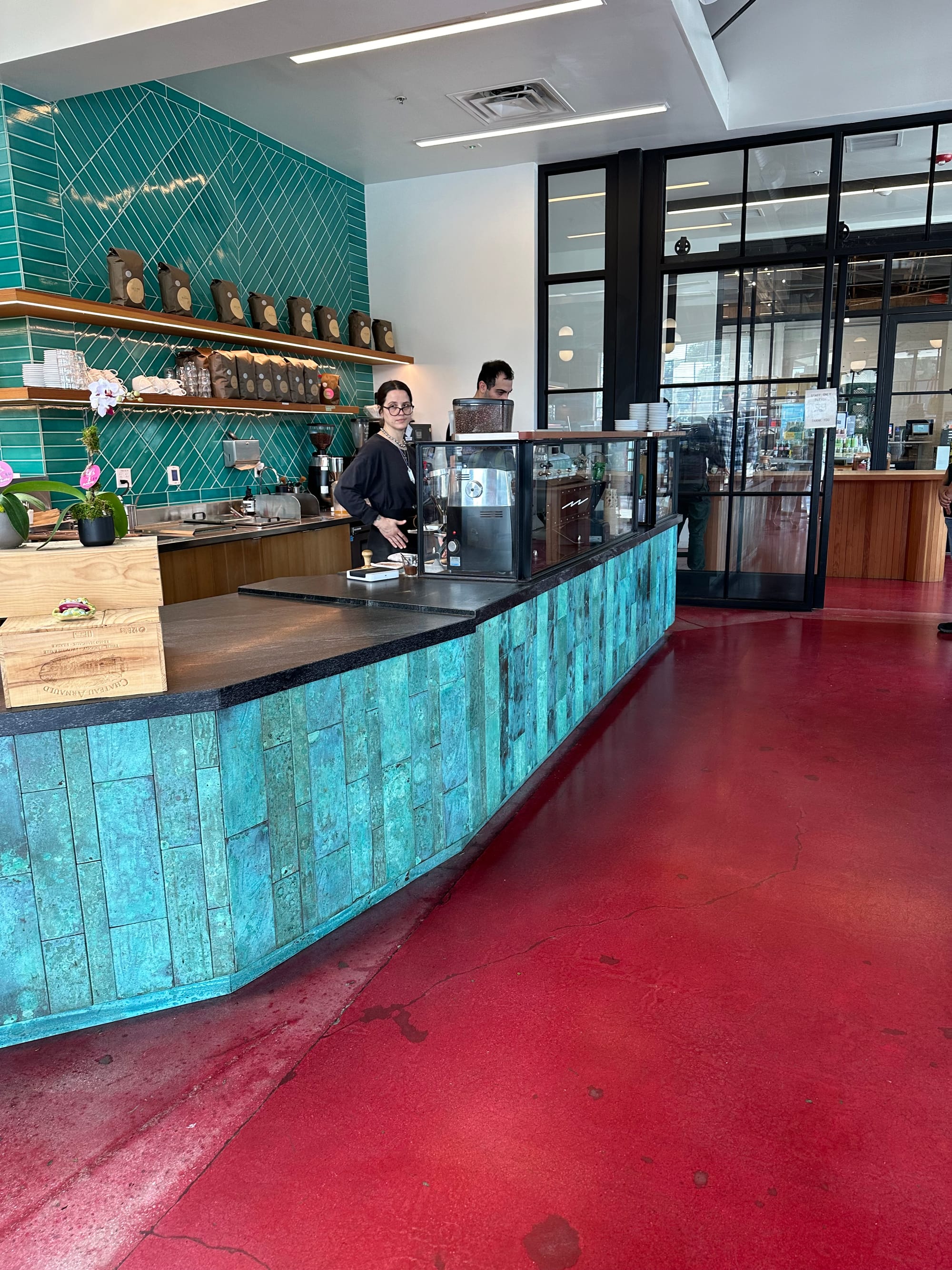
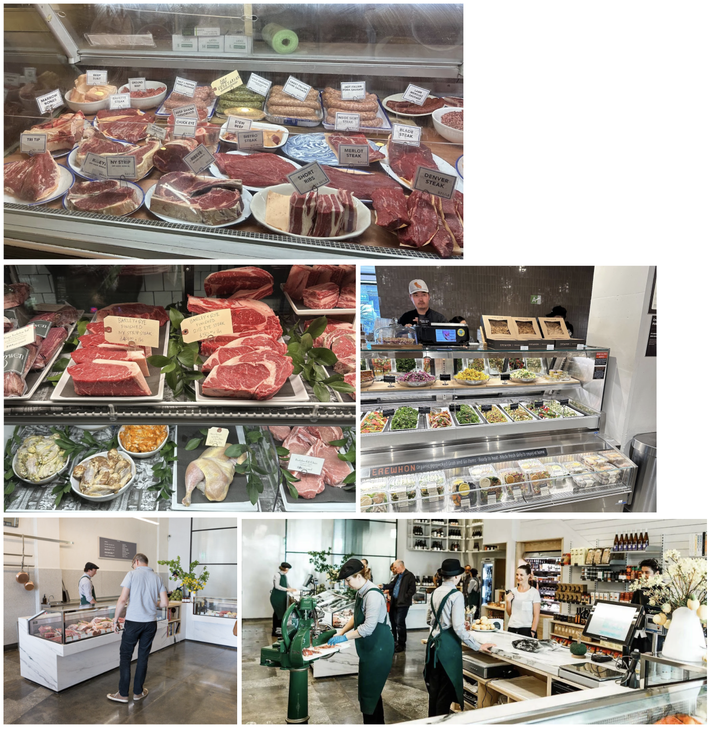
Photos from Marlow & Daughters, Sightglass SF, Bi-Rite Mission, Cookbook LA, Erewhon, and Sightglass LA
Summary
Guiding Design Inspiration. Utilitarian and warm. This is the overarching design inspiration that guides the others:
- Industrial beauty with creative repurposing.
- Minimalism with one or two vivid accent colors.
- An opinionated, intimate floor plan with displays of abundance.
- Expose just the right amount of the production process.
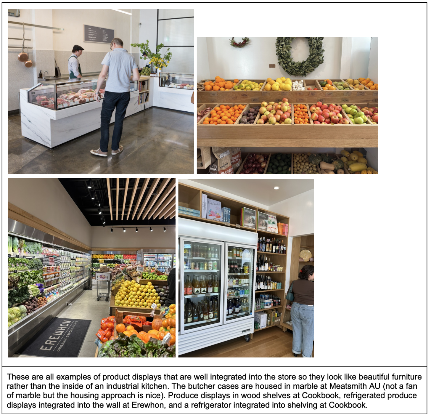
- Product displays should look more like furniture than kitchen appliances.
- Freshness is smell, sound, and sight.
Unique to Radius. Concepts we want to bring to Radius that we didn’t find in other stores.
- Farmer evangelism.
- Education and product depth.
- Interactivity.
- Texas-native materials.
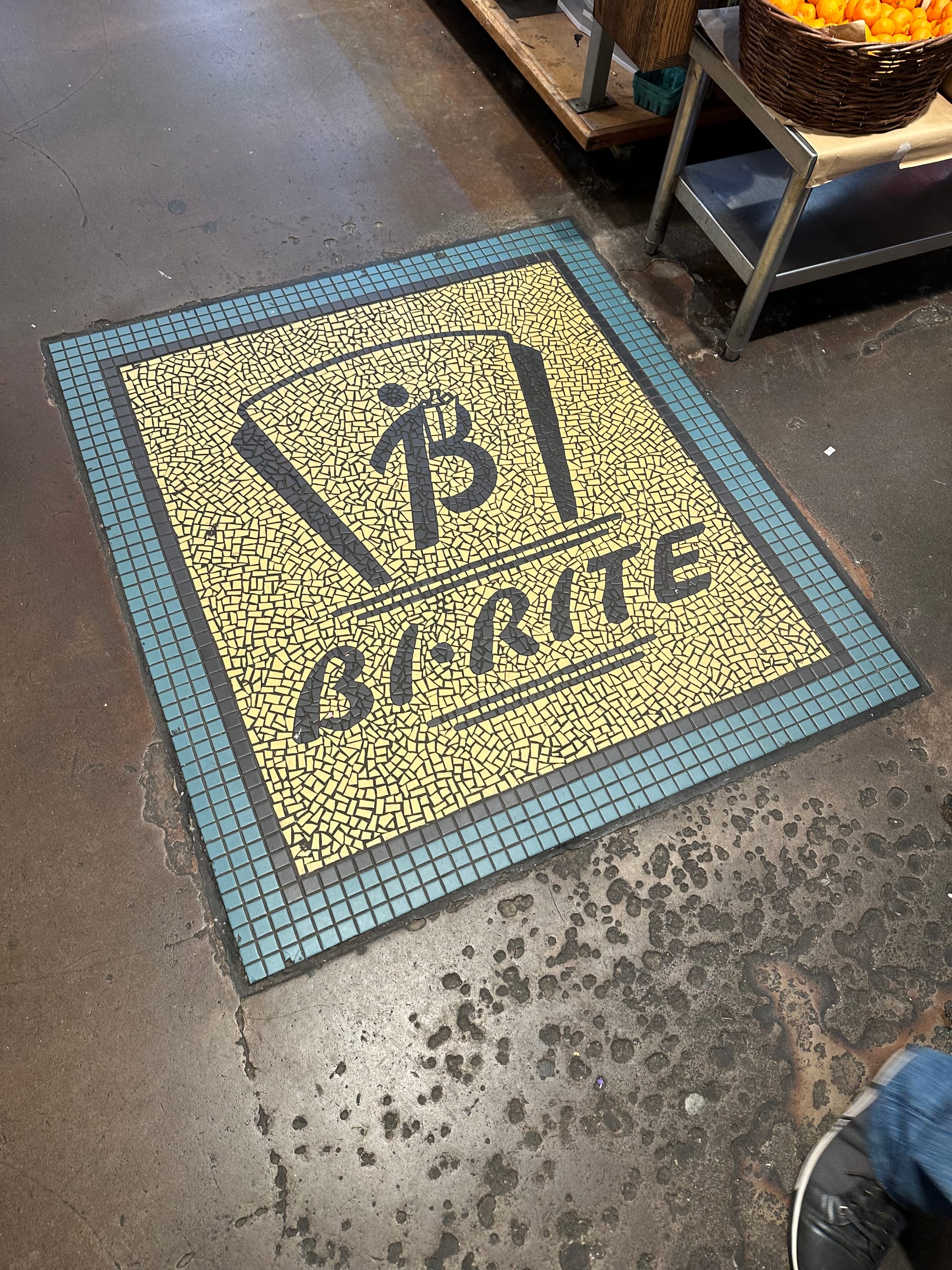
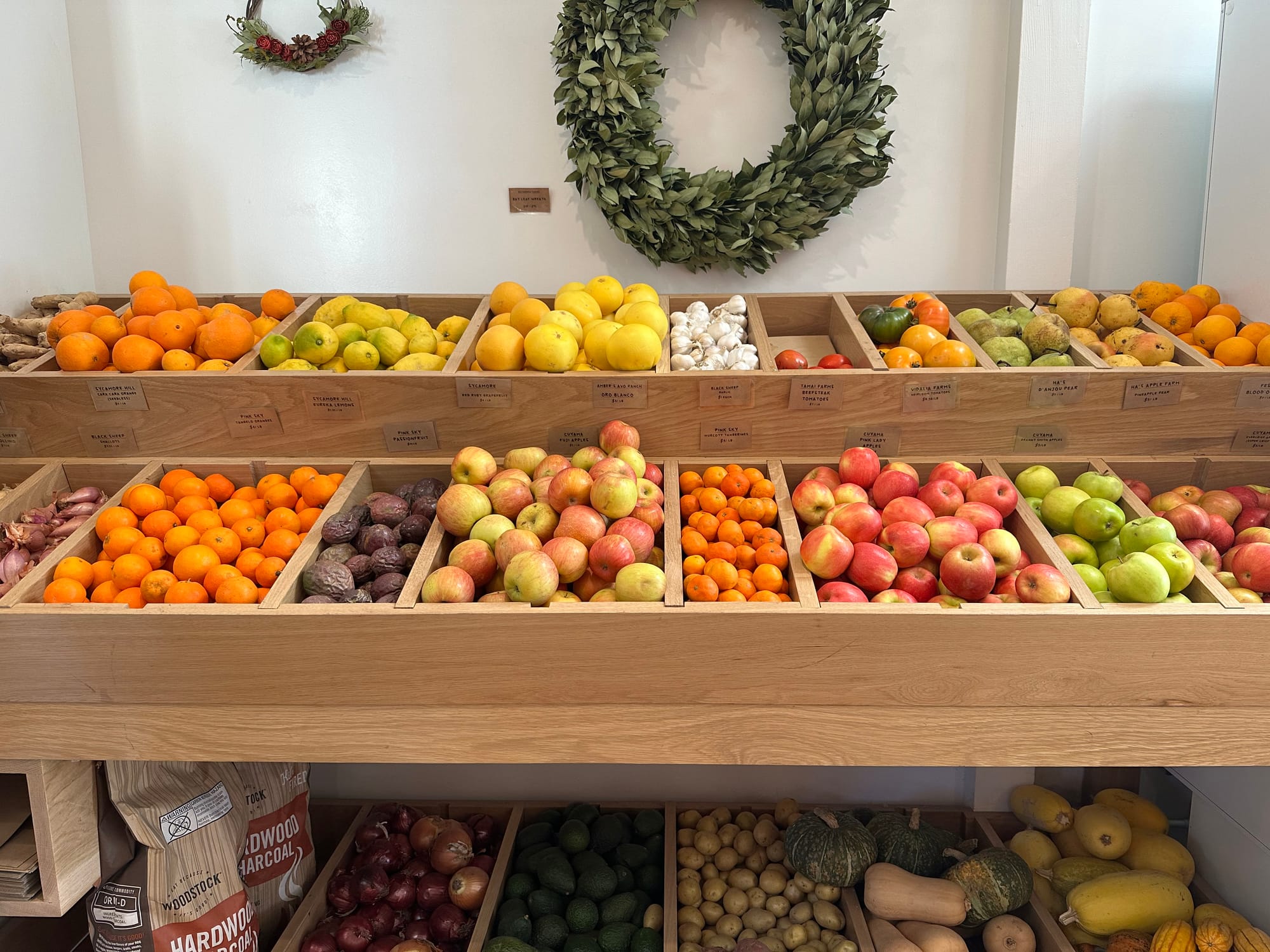
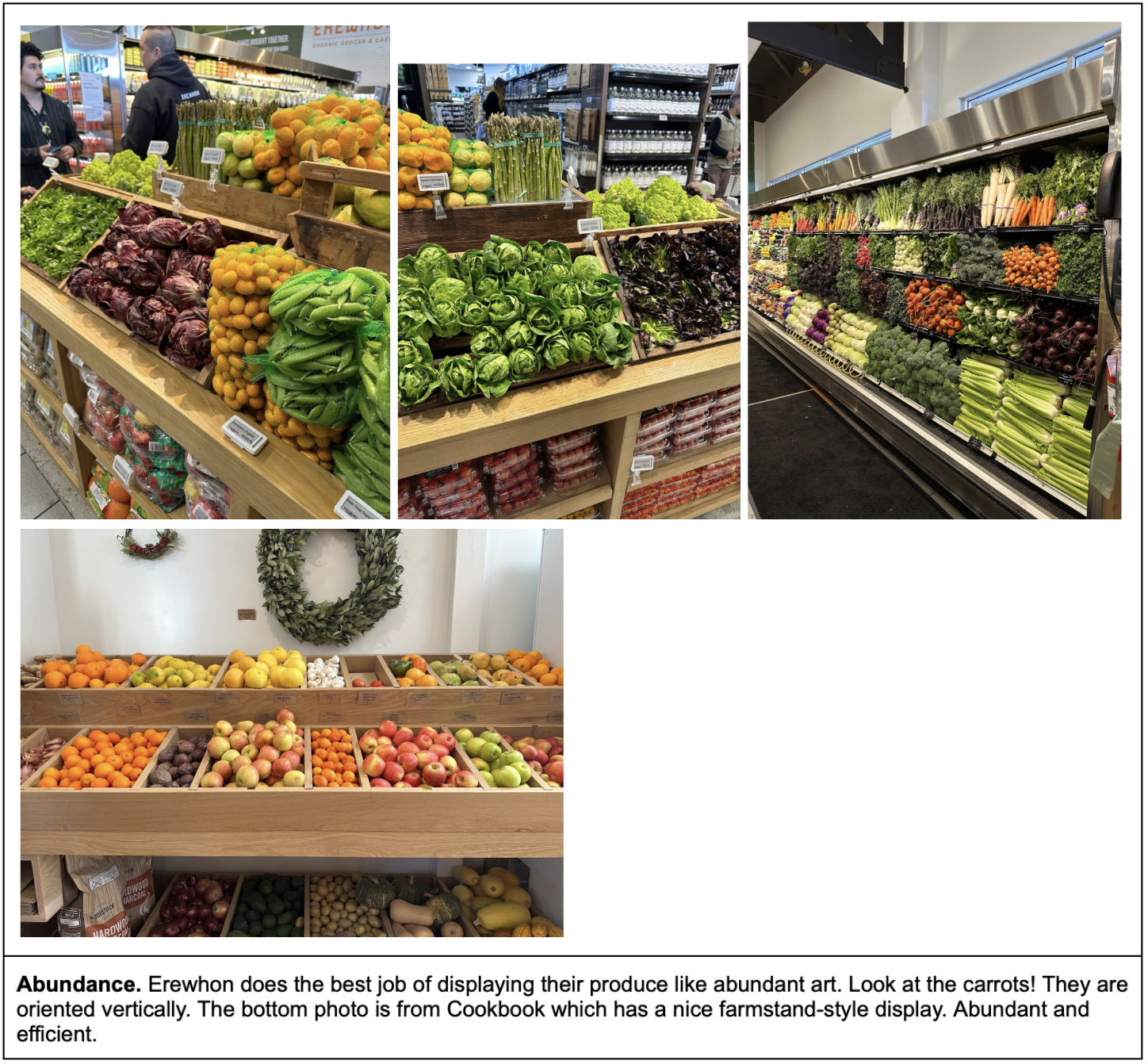
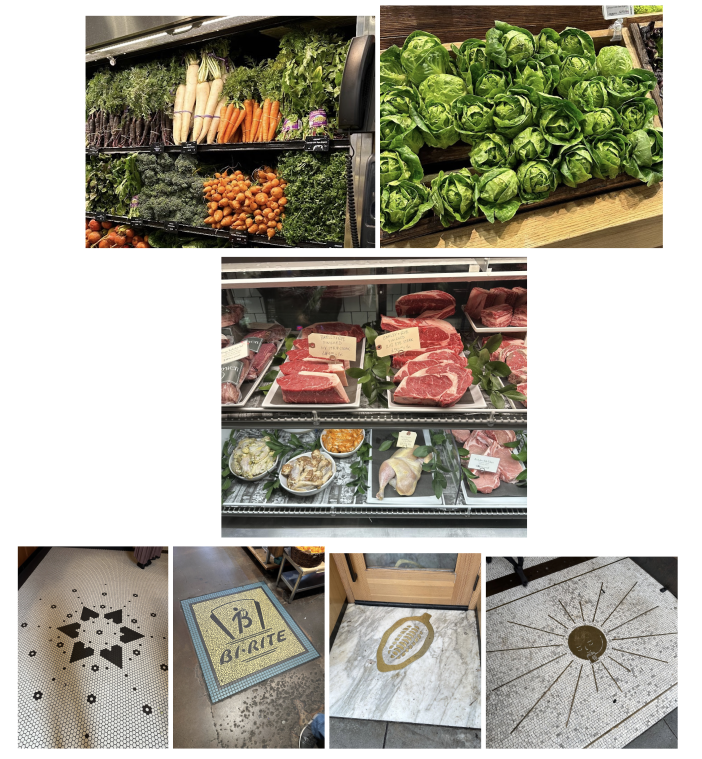
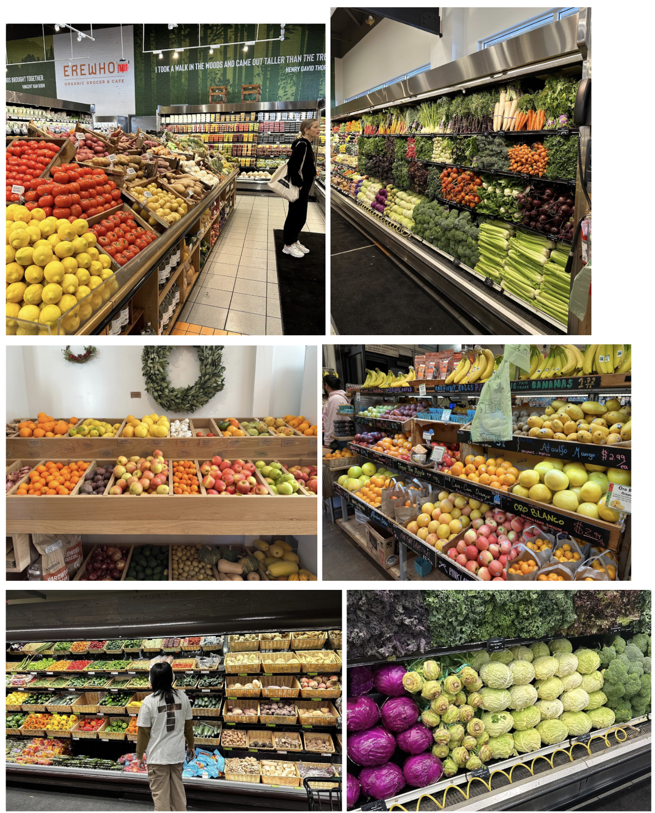
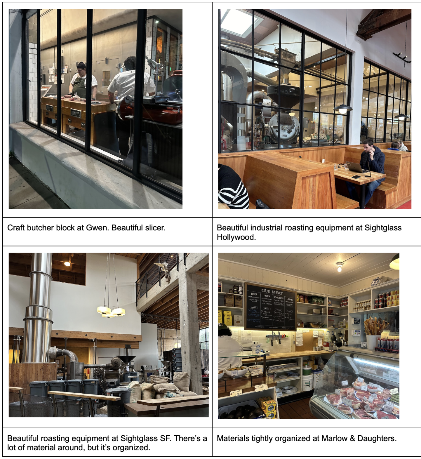
Vignettes. There are small details in some stores that inspire moments of joy. The upright carrots and blossoming lettuce at Erewhon. The Renaissance worthy meat case at Gwen. The floor mosaics at the entry of iconic SF stores. These are vignettes; little stories that capture the essence of a space. In modern day, these are “Instagram worthy” displays, but really they are visual moments that show how much we care about the details. If we care that much about what the floor looks like when you walk in or how the potatoes are lined up, just imagine how much we care about our sourcing standards, production process, and customer service. We’d like to have several of these moments across the store and be very deliberate with them.
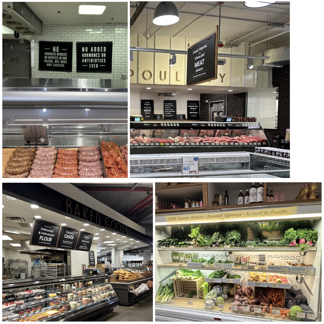
Design Details. Analysis of the core components of the store:
- Butcher cases
- Produce displays
- Dry goods shelving
- Signage
- Exposed equipment
Guiding Design Inspiration
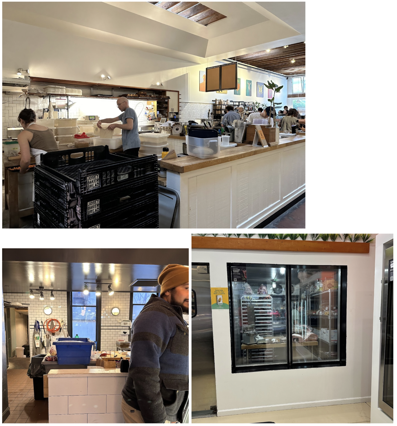
Utilitarian and warm. This is the overarching design that guides the others. Work gets done inside the shop (utilitarian); it’s not hidden away. It must still be an approachable, welcoming space (warm). The other design guidelines:
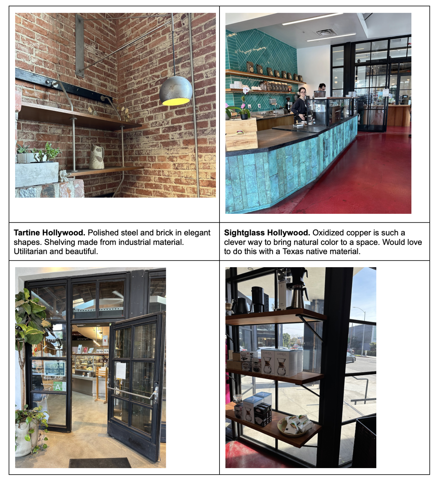
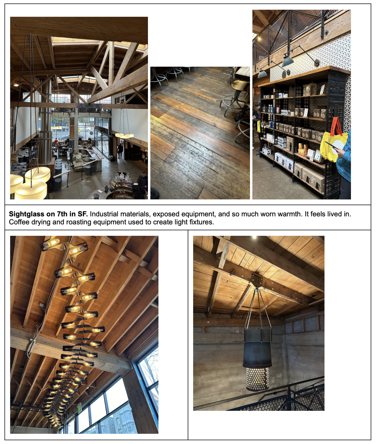
Industrial beauty with creative repurposing. Soften industrial materials with elegant forms. Use materials from the trade to create beautiful details.
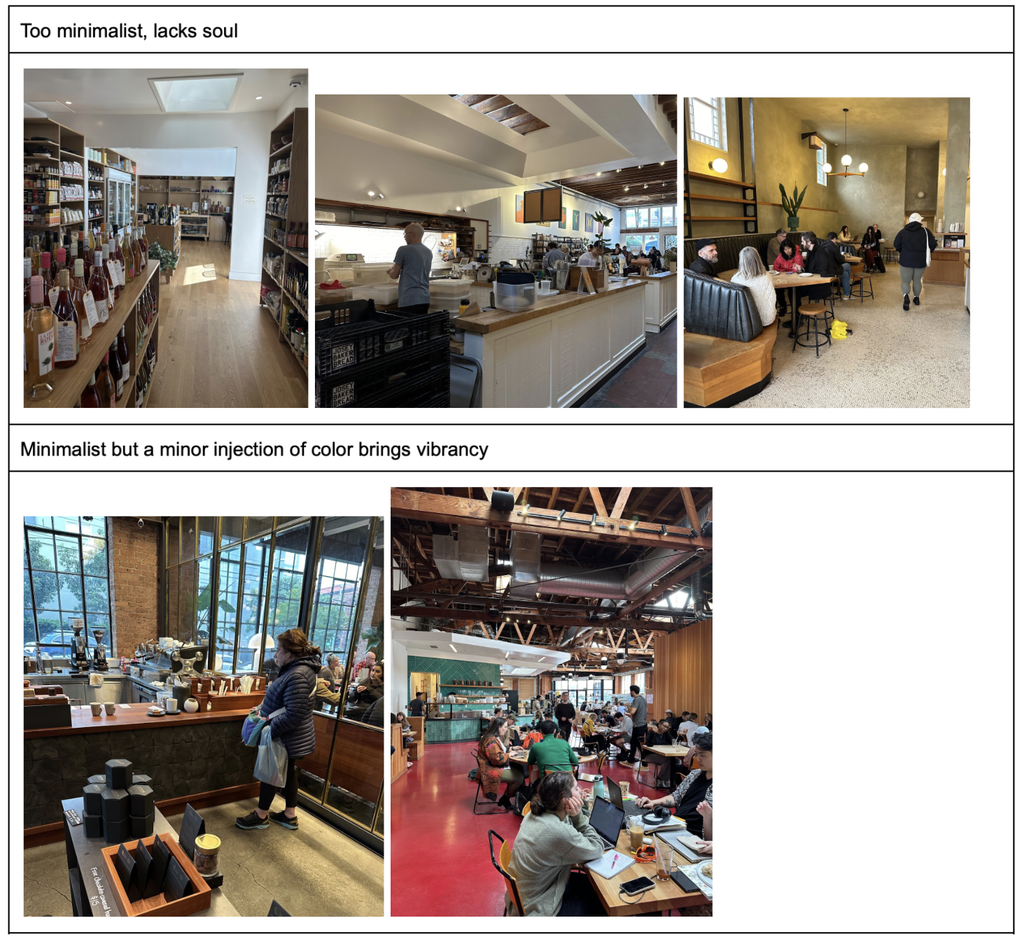
Minimalism with one or two vivid accent colors. Too much minimalism can feel antiseptic. One or two vivid accent colors breathes life into the space.
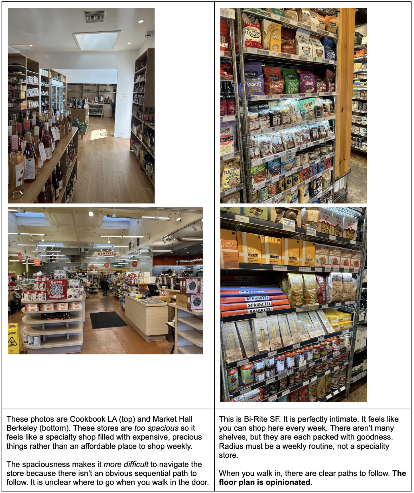
An opinionated, intimate floor plan with displays of abundance. The floorplan and distance between displays must balance spaciousness and intimacy. There should be a natural flow to the floor plan — customers intuitively should know where to go when they first walk in and how to sequentially traverse the store. Ideally that traversal mirrors how to plan a meal; pick a protein, then produce, then dry goods and sauce. It’s like a glorified Chipotle conveyor belt in farm-to-market grocery form.
The produce, proteins, and all products must feel abundant in their displays. Abundance conveys freshness, and it also conveys efficiency. We make use of every square foot.
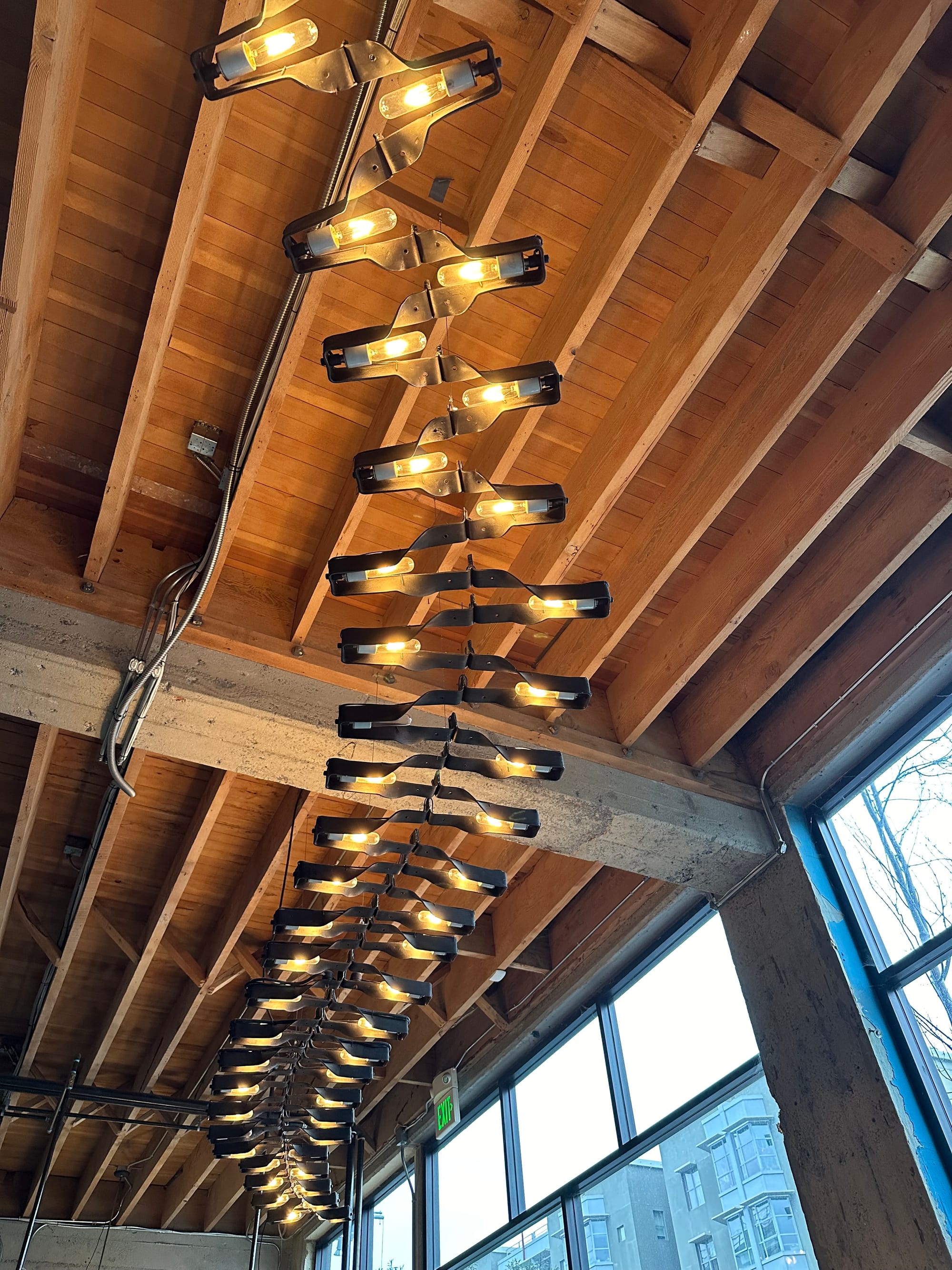
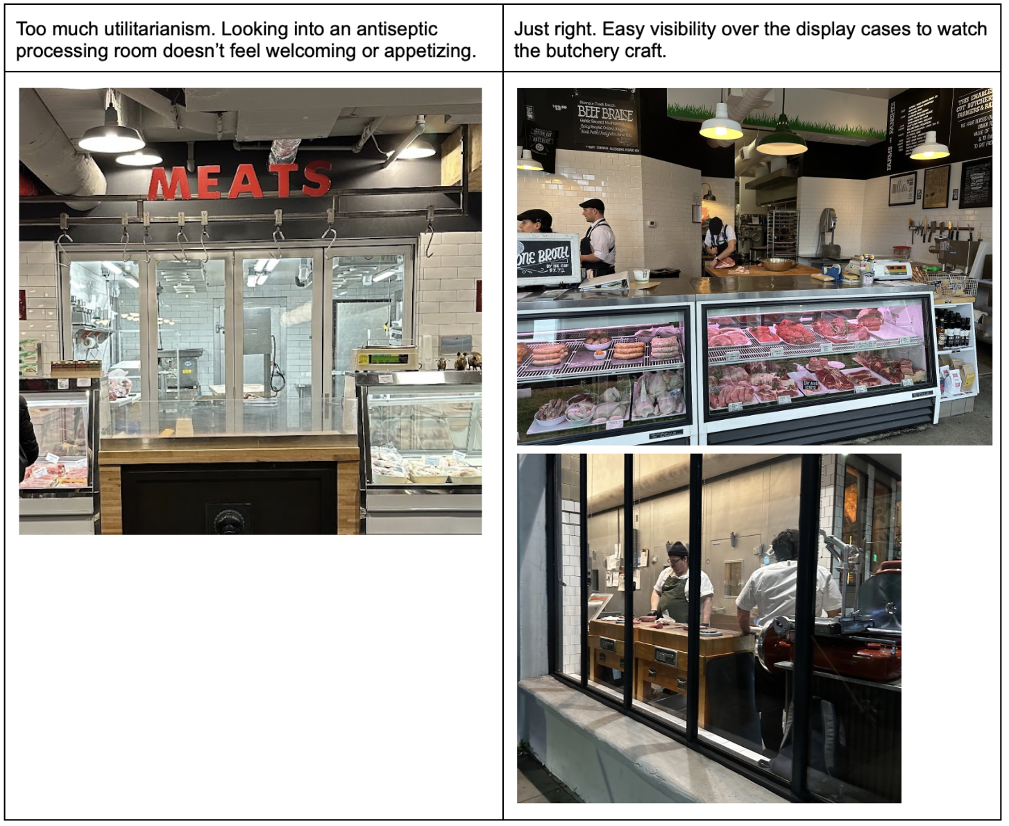
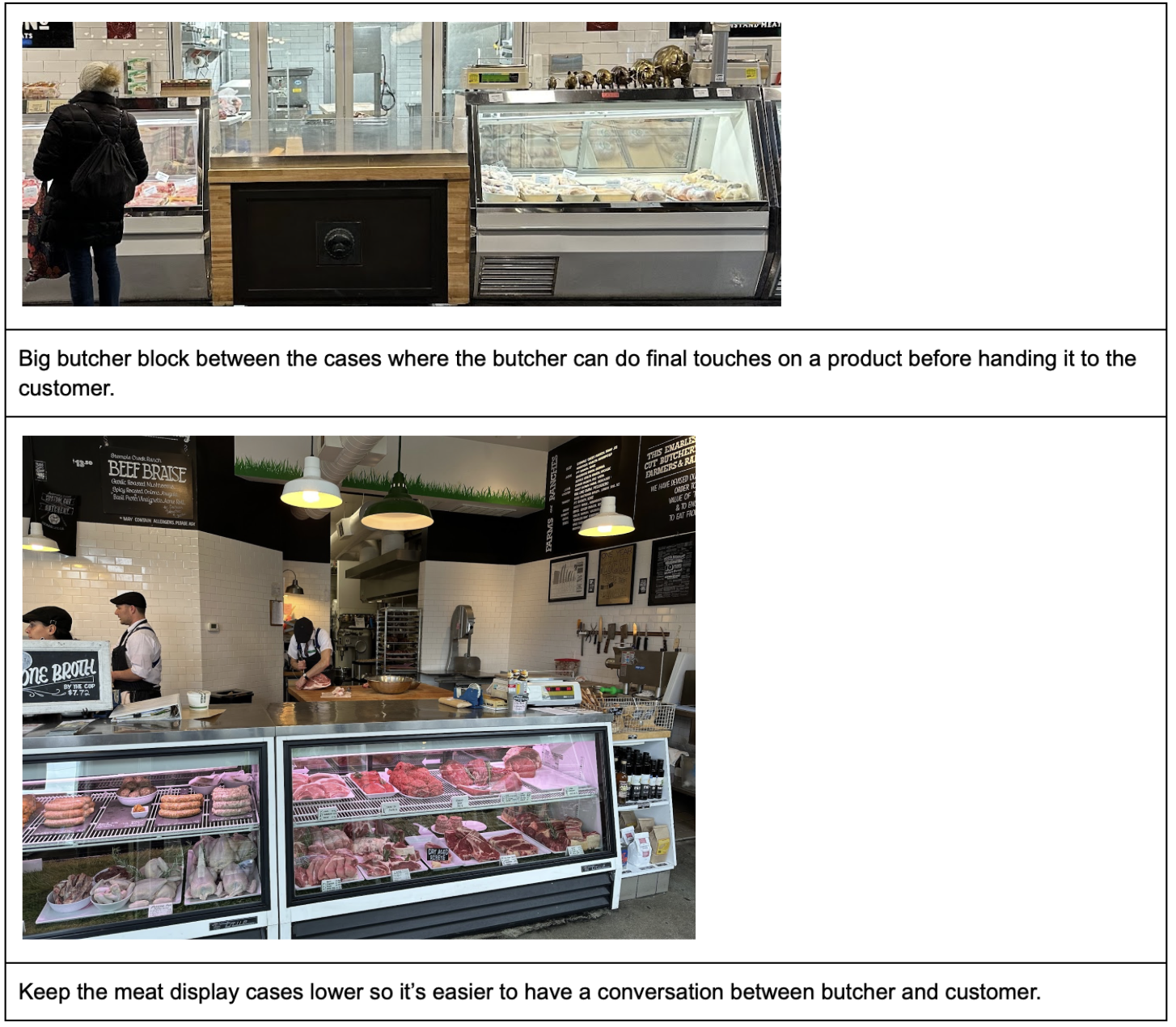
Expose just the right amount of the production process. Utilitarian and warm is the core guiding design principle. Too much exposed production, it deprives warmth. Too little, it loses utilitarianism. It’s more beautiful to watch craft processing on a big butcher block table in an open kitchen than to watch bulk processing in a sterile processing room. A window into the processing room is overrated, while an open kitchen is underrated.
Product displays should look more like furniture than kitchen appliances. Just because refrigeration and displays are practical, doesn’t mean they shouldn’t be beautiful too. They must be utilitarian and warm.
Comfort is smell, sound, and sight. The first sensation when walking into a food store is smell. Big grocery stores don’t smell like anything. Small butchers with poor quality practices smell rancid. Small butchers and groceries with good practices smell fresh, inviting, and familiar. The three most vivid memories from the trip are all smells:
- Fresh oranges right when walking into Bi-Rite
- Toasted clove right when walking into Prospect Butcher Co
- So much ripe fruit and vegetables in Monterrey Market
We must design the floorplan to optimize for beautiful smells right upon entry. Oranges (when in season), broth, smoked bacon, toasted spices. Some floorplan ideas:
- Open kitchen so stock and broth smells can permeate the space
- Ensure the sweet smell from the smoker comes into the store
- Produce stands close to the entry so we can put in-season, fragrant produce there
- Toast spices during the holiday season
This same mindset will extend to sound and sight as well. Balance familiarity with novelty.
Unique to Radius
While the architecture tour was super inspiring, there are a few aspects of Radius that were not done well at any of the places we visited. We want to emphasize:
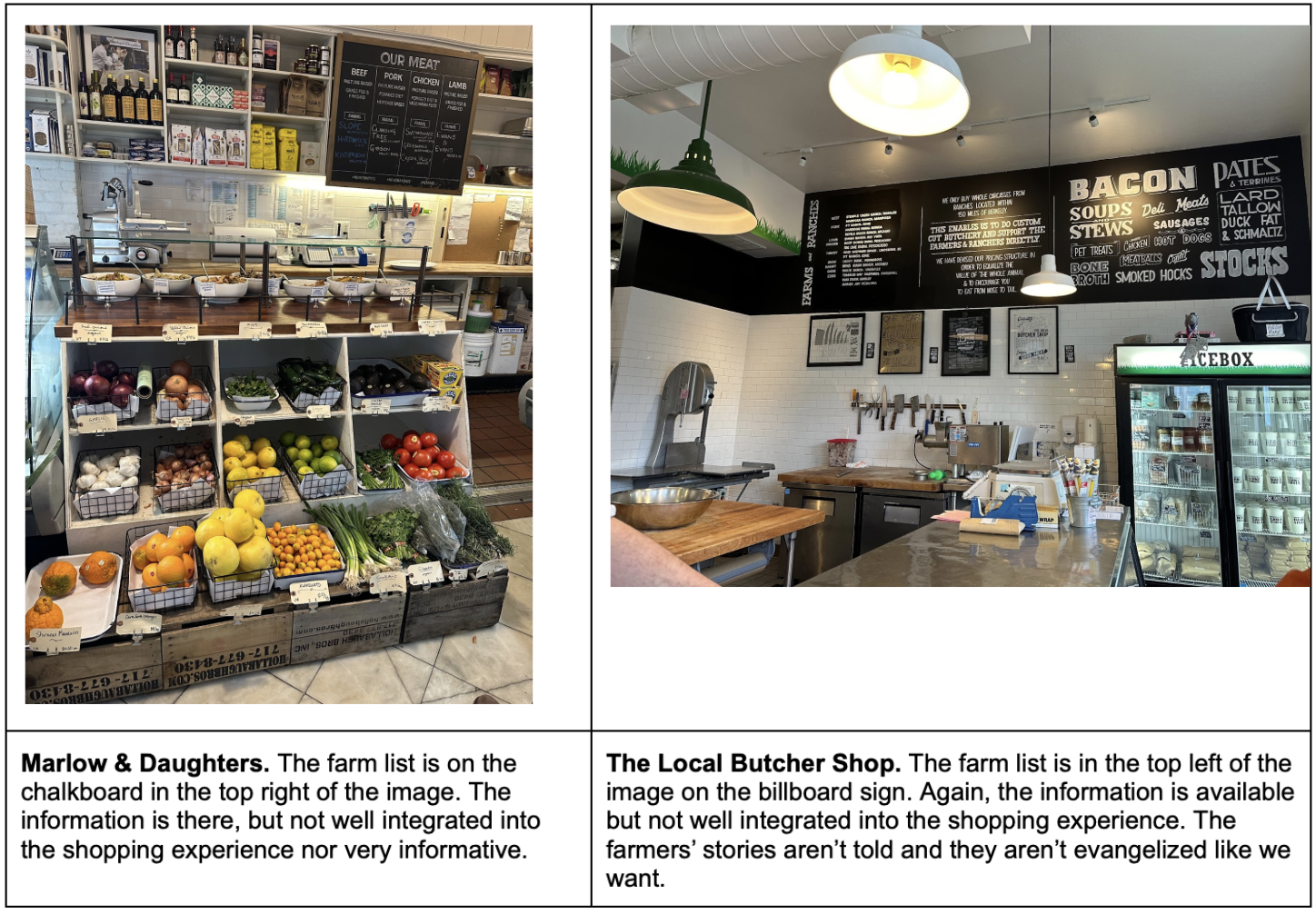
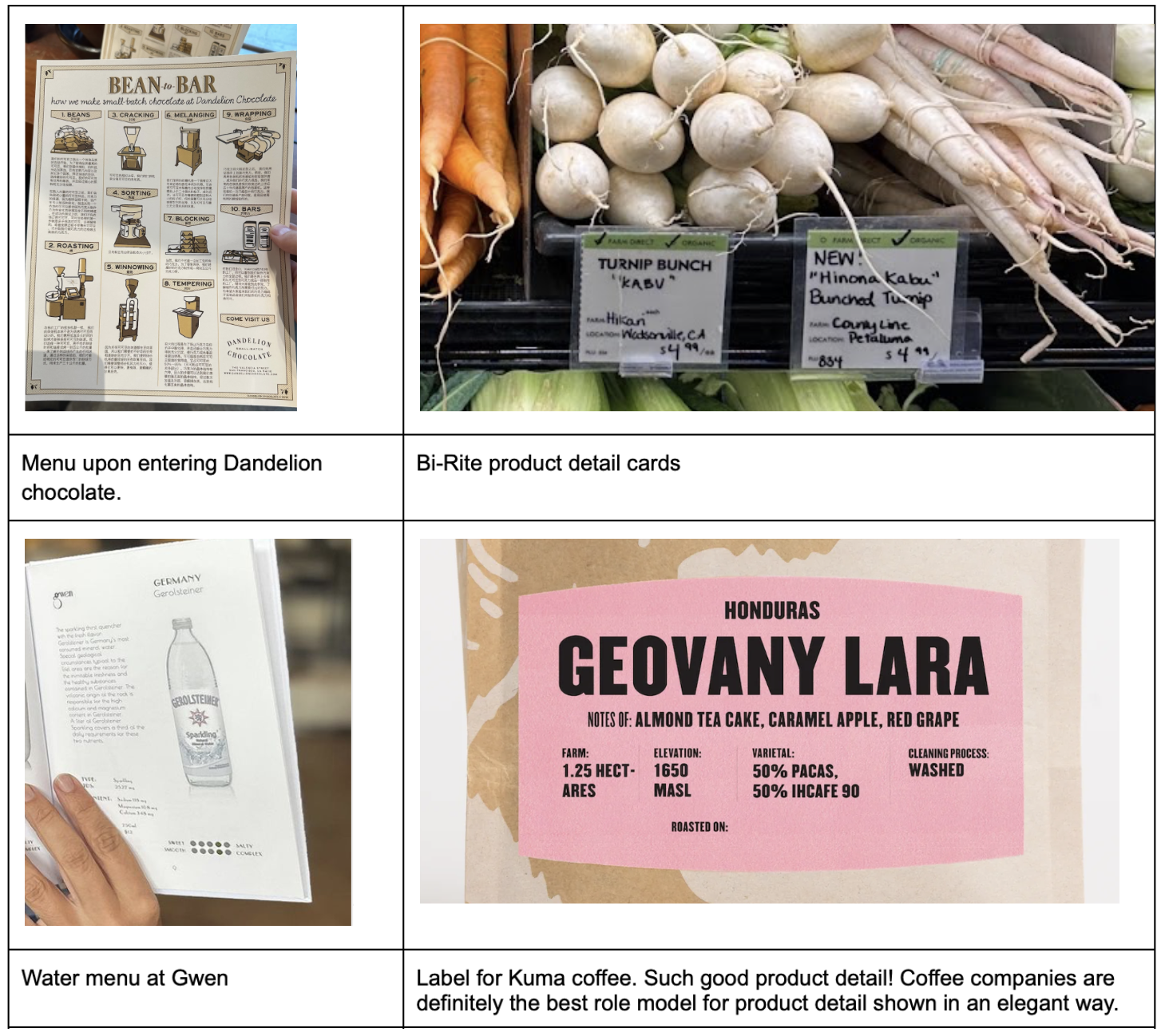
Farmer evangelism. Some shops had lists of their farm partners, but the signs were difficult to read and removed from the shopping experience. Below are two examples of this done poorly. No shop made the farmers heroes and a prominent presence in the store. We want to tell the farmers’ stories in a way that is more detailed and integrated into the core shopping experience.
Education and product depth. No store had the equivalent of a menu or something to grab and read when you walk in the door. Education will be a core component of Radius — monthly seasonal menus, detail about farms, detail about each product (diet of the animal, micronutrient profile, name of the farm, farm location, etc). The educational goal of Radius is to teach people to cook well with local, seasonal ingredients. Cooking well requires learning about:
- What is in season
- How ingredients are grown, and how it affects the nutrient profile and taste.
- What ingredients complement each other
Interactivity. Cooking is fun; it’s collaborative, experimental, and spontaneous. None of the stores felt like that. We want Radius to be interactive — have a conversation with the butcher about what you’re thinking about making for dinner, watch the butcher cut a fresh steak, ask questions about techniques. Examples of how to bring some interactivity into the space:
Texas native materials. We’d like to use Texas-native materials (brick, wood, leather, etc) where reasonable. It doesn’t need to be forced. But if choosing between a white oak or a Texas post oak, let’s go with the Texas material. If locally sourced brick fits into the aesthetic, awesome. If not, no problem. We need to be careful to use Texas materials, but not make the store Texas themed. No cow prints.
Vignettes
There are small details in some stores that inspire moments of joy. The upright carrots and blossoming lettuce at Erewhon. The Renaissance worthy still life meat case at Gwen. The floor mosaics at the entry of iconic SF stores. These are vignettes, little stories that capture the essence of a space. In modern day, these are “Instagram worthy” displays, but really they are visual moments that show how much we care about the details. If we care that much about what the floor looks like when you walk in or how the potatoes are lined up, just imagine how much we care about our sourcing standards, production process, and customer service. We’d like to have several of these moments across the store and be very deliberate with them.
Below are some ideas for vignettes. These are very much just draft thoughts to spark conversation. We’re not wed to any of these. All of these moments should be picture worthy, thoughtful, and convey the overall care of Radius.
- Meat case displayed like a banquet table of beautiful platters.
- Produce positioned in their displays to show their natural beauty.
- Tile mosaic on the floor upon entry.
- Visibility into the processing room. Instead of big windows into an antiseptic space, could we have multiple smaller windows like portholes? Customers would have to go up to the smaller windows and make an effort to watch. Active watching will encourage more appreciation for the craft, versus passively seeing processing in the background. It should be an event, and a smaller viewing window makes it more like a show. On the wall with the portholes we could have wording “Making it” or “Watch how the magic gets made”. We want to avoid saying “watch how the sausage is made” since it’s too cliche.
- Wall of sauce. We’re going to have sauces from world-class restaurants to help customers level up their cooking. Let’s display them in a fun and beautiful way. Can we incorporate “staff picks” into this?
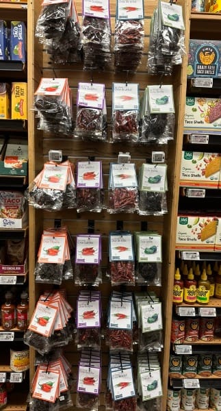
- Chile display. Similar to the wall of sauce, we’d like to have multiple varieties of chiles — the best selection in Austin. How can we display them in a novel and beautiful way? These chiles at Whole Foods could be so much more engaging if displayed well!
Design Details
A butcher and grocery store only has a few core components. The meat case, produce displays, dry good shelving are really the heart of the store. The signage, smells, and equipment are the accents. We saw a lot of each of these components; below is an analysis of what we liked and disliked for each.
This section is more detailed than the previous ones; treat it like an appendix of supporting information.
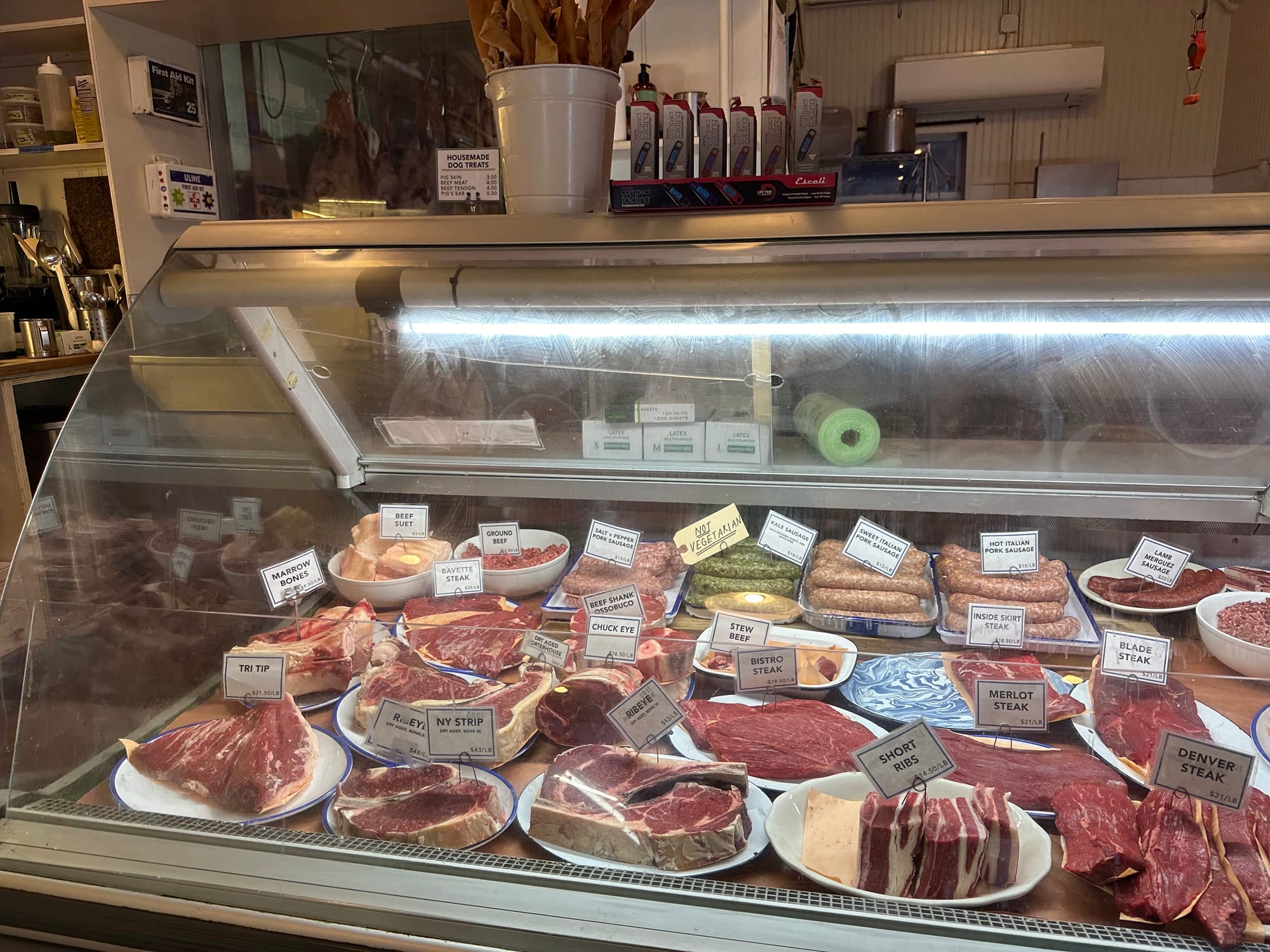
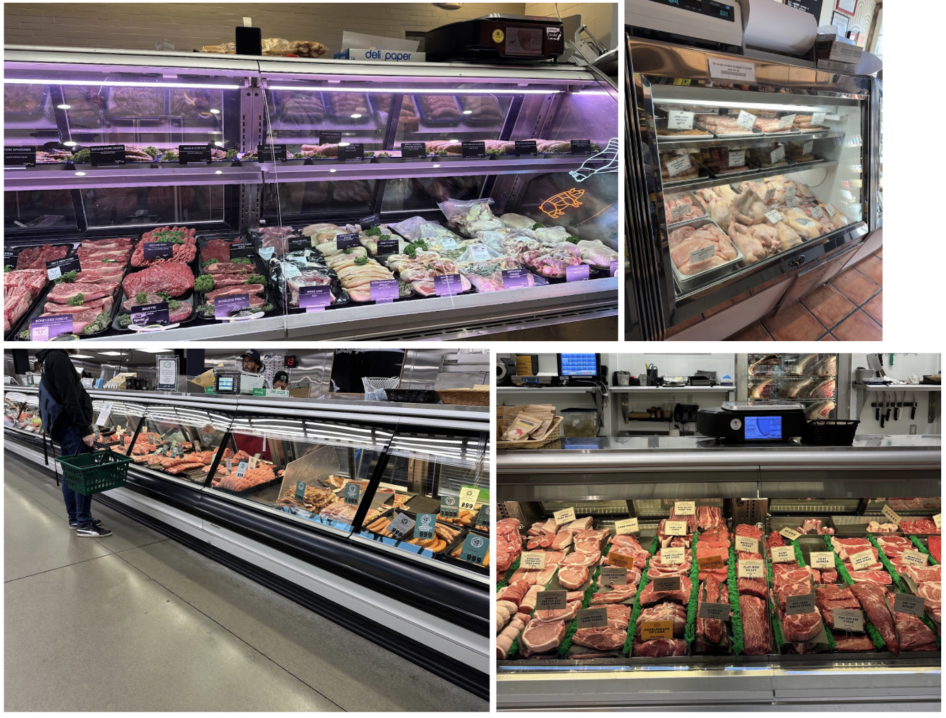
Butcher Cases
Like: Displays that look like a banquet table of beautiful platters.
- Products on platters or butcher blocks rather than plastic or metal trays. Fresh herbs inside the case.
- Products displayed at varying heights within each shelf.
- Cases that are lower to facilitate a conversation between butcher and customer and easy viewing into an open kitchen.
- Cases that are integrated and look like furniture rather than kitchen appliances. Meatsmith in Melbourne, AU does a nice job of this (these are the bottom photos).
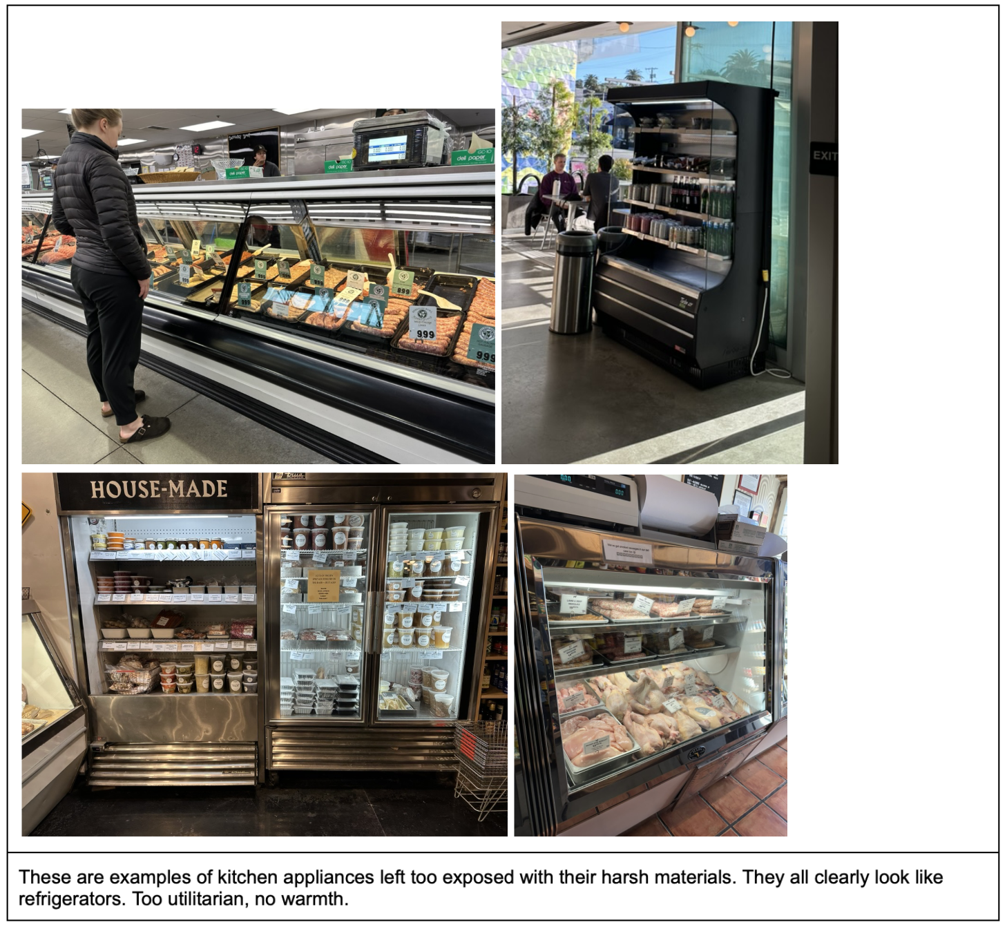
Dislike: Filing cabinets of meat
- Symmetrical, cramped rows
- Synthetic materials inside the case
- Very high cases so you can only see the butcher’s head
- Stainless steel kitchen appliances
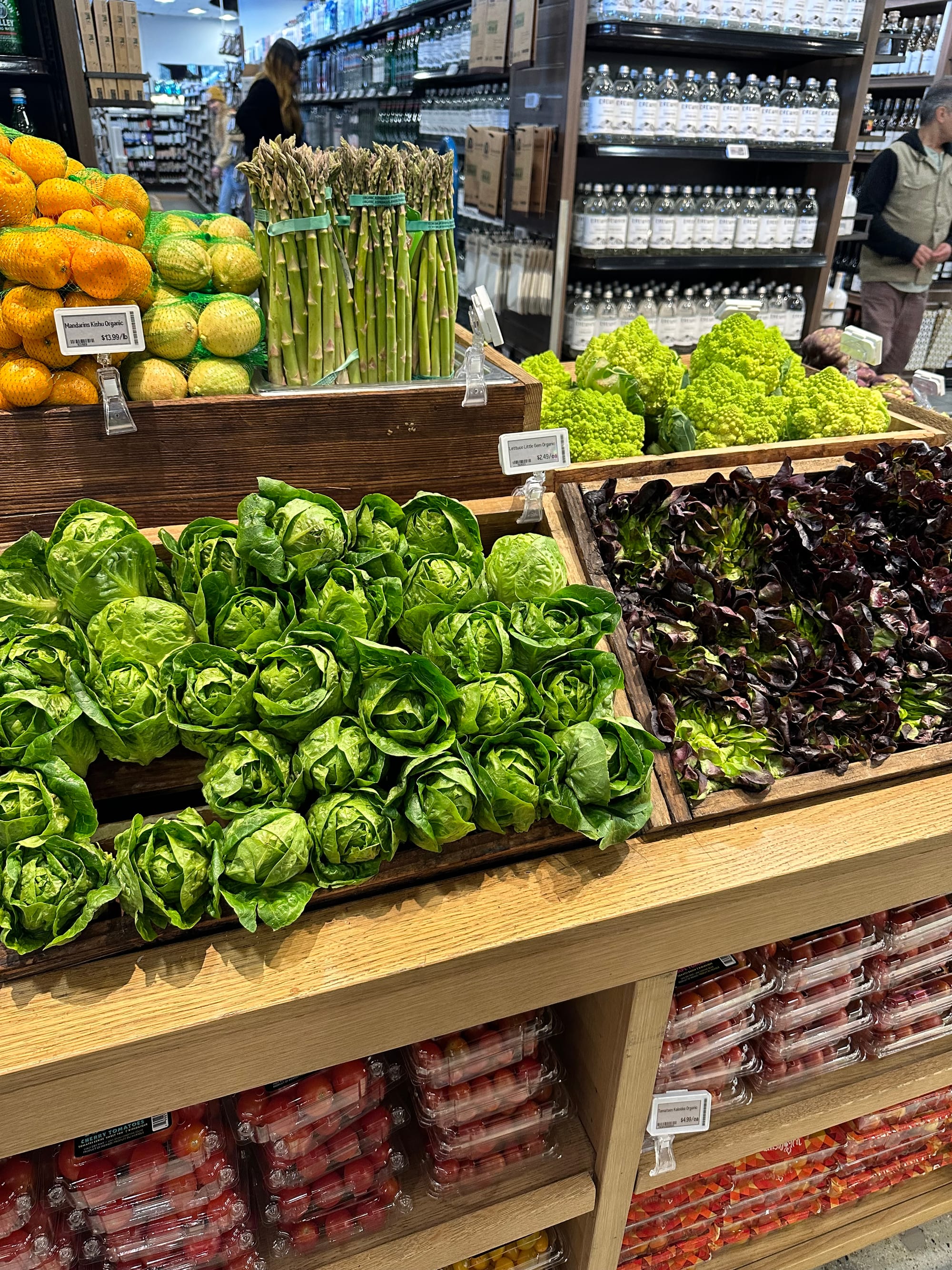
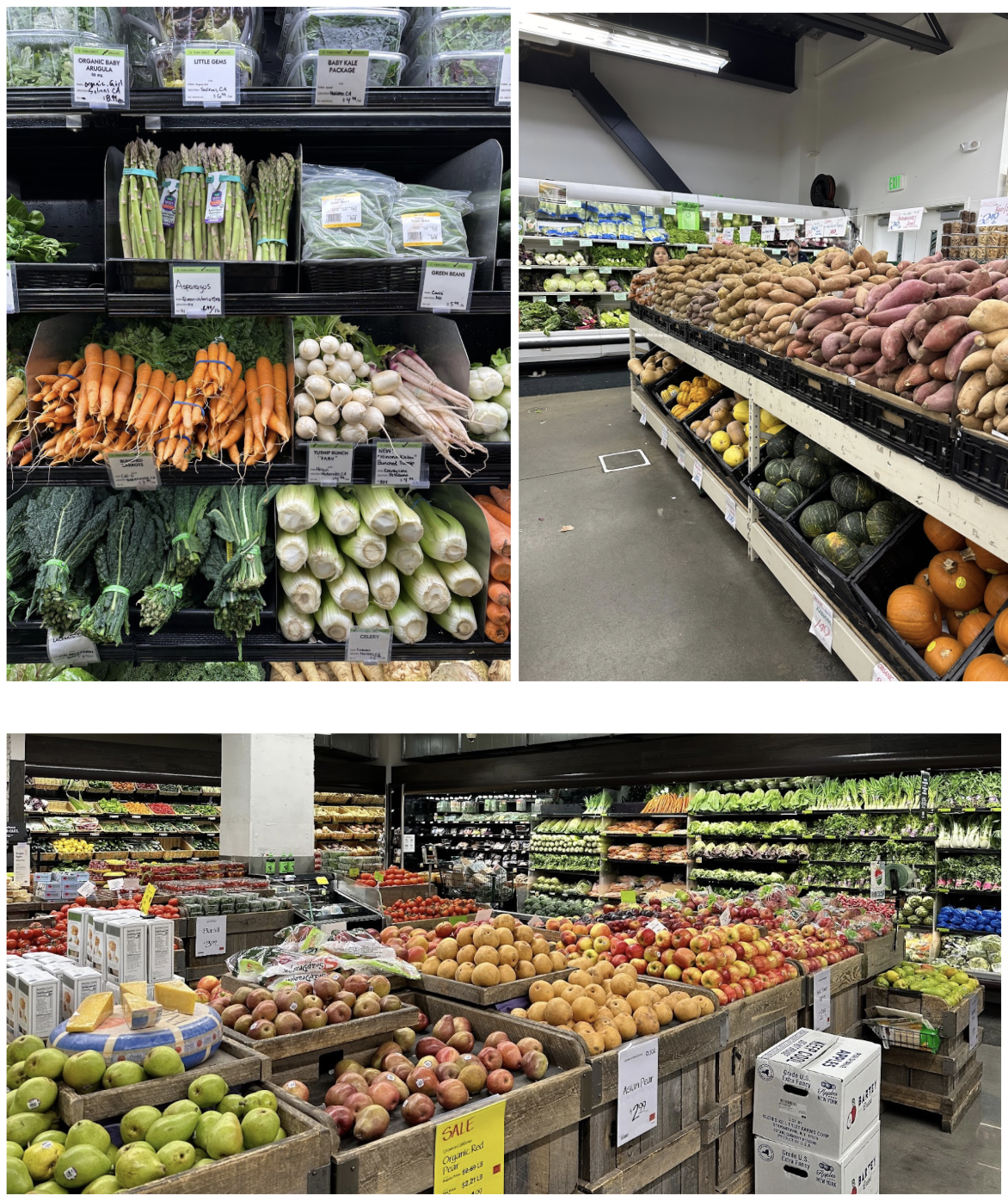
Produce Displays
Like: Minimalist farmstand that uses space efficiently
- Non-refrigerated displays with multiple shelf heights down to the floor. Efficient space.
- Angled shelves for more efficient use of space and better visibility of the product.
- Tightly packed produce without visible dividers.
- Wood material where feasible.
- Looks like furniture rather than kitchen appliances.
Dislike: Fake farmstand
- Faux farmstand accent materials
- Plastic containers or dividers
- Inefficient use of space by not having multiple shelves or having overly deep shelves that take up floor space
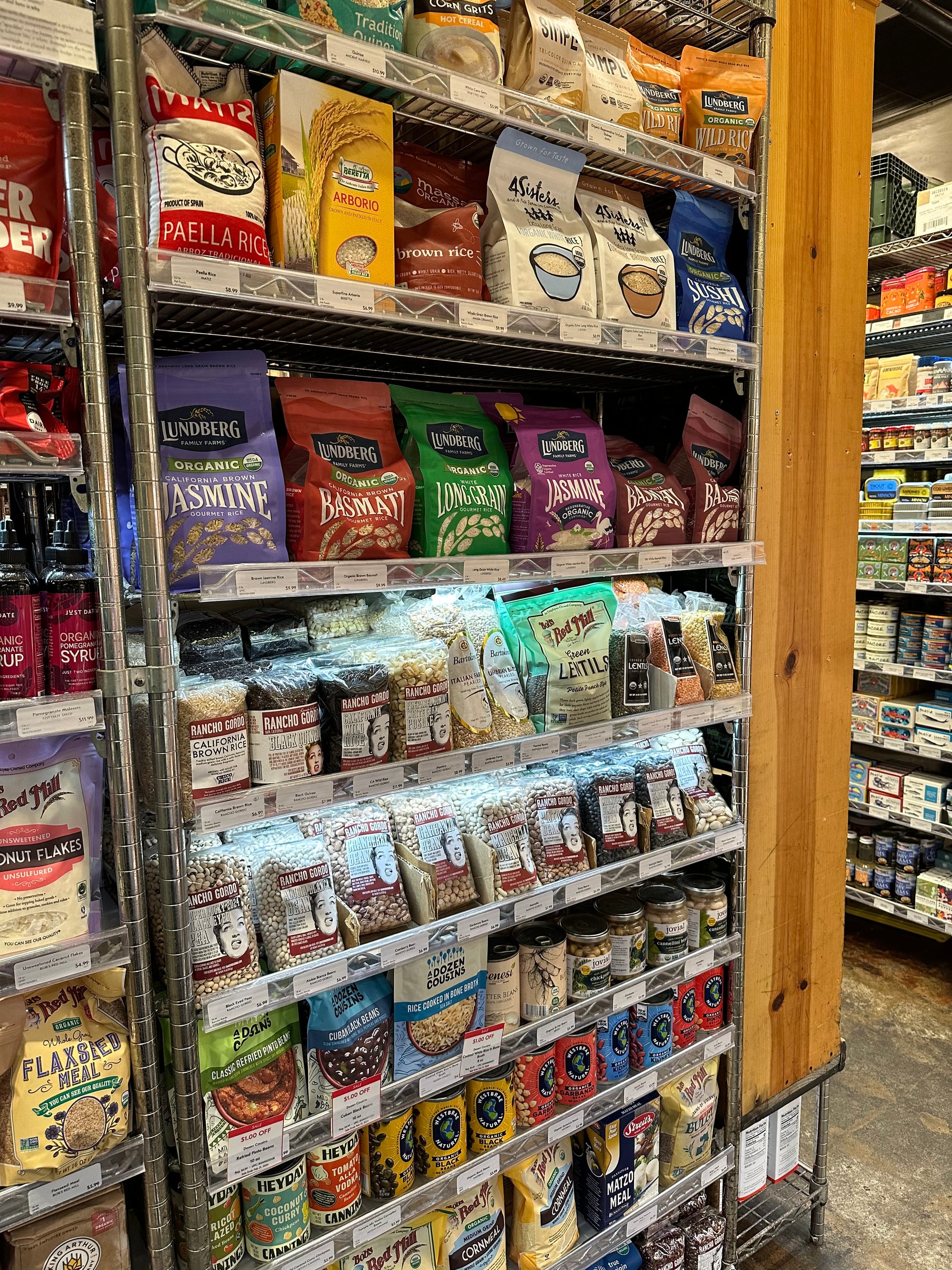
Dry Goods Shelving
Like:
- Tightly packed shelves with curated options in each category. It feels like every single item deserves to be there. Display the best tomato sauce brand; don’t give me 10 options.
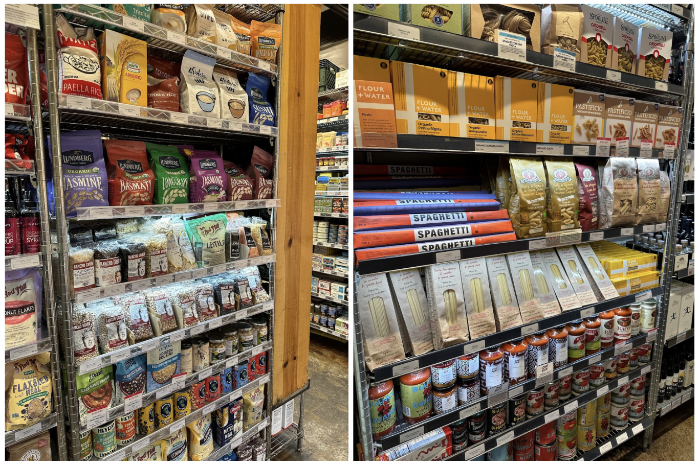
Dislike:
- Spaciousness. Floor space is limited, use it well. Don’t waste it.
- Tons of options in every product category. 5 different brands of dried pasta is overwhelming. Especially if every product category has tons of choices, it takes up a ton of space and makes shopping like taking the SATs.
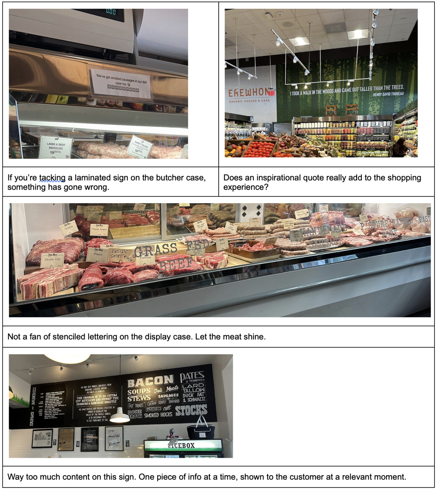
Signage
Like:
- Educational information, concisely conveyed. Each sign makes one point.
- In the direct line of sight of the shopper.
- Deliberate space for the sign, not just tacked on as an afterthought.
Dislike:
- Signs put in arbitrary places.
- Wording on glass display cases that obscure the products.
- Inspirational quotes.
- Signs not in the natural sights of the customer.
- Signs with too much content. Put the right information in the right place at the right time.
Exposed Equipment
Like:
- Organized, clean spaces. Everything has a home.
- Equipment that is actually beautiful.
Dislike:
- Cluttered, unorganized spaces.
- Visibility into a storage space. What’s the point?
List of shops we visited
Favorites in bold.
- LA: Tartine Hollywood, Sightglass Hollywood, Erewhon Grove, Original Farmer’s Market, Cookbook Larchmont, Erewhon Silver Lake, Tartine Silver Lake
- SF: Sightglass 7th, Four Barrel, Bi-Rite Mission, Tartine (2), Sightglass 20th, SF Meat Co, Souvenir Coffee, Sightglass Divis, The Mill, Olivier’s, Niku
- Berkeley: The Local Butcher Shop, Market Hall, Berkeley Bowl
- NYC: Dickson’s, The Meat Hook, Winner, Marlow & Daughter’s, Prospect Butcher, Ends Meat